SharkBoy
Great White
2 is the best out of that lot.
What the heck happened to out deal with ISC?

I actually like them tight fitting because it makes me feel like a player but I know that is just me
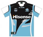
Of the options, number two is definitely definitely the best option. However, I don't understand why we wouldn't just change the colours of our current home jersey? I tend to think it is one of the better designs in the league right now for something that has no history. I drew up what it looks like with the colours flipped and I think it is a bajillion times better than any of those options.
I actually like them tight fitting because it makes me feel like a player but I know that is just me
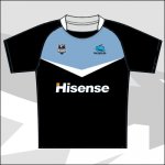
Number 1 for me with black shorts and socks !!!! Go, shoot me down ****ers lol
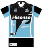
Of the options, number two is definitely definitely the best option. However, I don't understand why we wouldn't just change the colours of our current home jersey? I tend to think it is one of the better designs in the league right now for something that has no history. I drew up what it looks like with the colours flipped and I think it is a bajillion times better than any of those options.
I actually like them tight fitting because it makes me feel like a player but I know that is just me