You are using an out of date browser. It may not display this or other websites correctly.
You should upgrade or use an alternative browser.
You should upgrade or use an alternative browser.
2011 Jersey Designs
- Thread starter mtk
- Start date
El Coconuto
Great White
I still loathe that design. It's like a touch footy teams jersey.
SF
Mako Shark
I just got back from touch footy ")
I do think the first two were probably put there to make us happy with whatever ends up getting selected.
I do think the first two were probably put there to make us happy with whatever ends up getting selected.
Agree with the numbers on the front (for the away jersey). Would be a good trend setter.I'd love to see an "NFL" style of design tried, with numbers front and rear and the players name on the back.
El Coconuto
Great White
My thing is, if the whole purpose of the away jersey is to stop teams with similar colours from clashing, why are we tossing around options that are similar to our current design anyways?
snowman
Total gronk
i like the re design of 3 SF.
yours is the best one coco... apply for a job
yours is the best one coco... apply for a job
SF
Mako Shark
True. I just worry with the black. I remember the game we played last year at home in blazing heat on a Sunday arvo in the black jersey, and got belted.My thing is, if the whole purpose of the away jersey is to stop teams with similar colours from clashing, why are we tossing around options that are similar to our current design anyways?
snowman
Total gronk
or colours like the panthers ones
if this is true then see you isc...
Apparently the new Blades deal is a beauty heaps more cash, more than our major sponsor. It's all good people, except for those designs, they might have to rethink.
if this is true then see you isc...
Last edited:
sharkafar
Bull Shark
Number 1 would be useful as very expensive toilet paper.
I think we should go with a sky blue base and a white band acrosss the chest, bordered with black. But then, what do I know...:dougy:
I think we should go with a sky blue base and a white band acrosss the chest, bordered with black. But then, what do I know...:dougy:
snowman
Total gronk
nice SF... expensive tioled paper, what does it feel like?
sharkafar
Bull Shark
nice SF... expensive toilet paper, what does it feel like?
Soft and satisfying. :good:
The middle one's great... the other's suck balls. Particularly the last one.
Really dig the middle one though. Why can't we have that as our away jumper and the regular one as our home jumper? Like proper alternate strips?
Really dig the middle one though. Why can't we have that as our away jumper and the regular one as our home jumper? Like proper alternate strips?
Mr Wright
Jaws
Coco's is the best and I imagine it would be the easiest for Blades to make, considering it is pretty much our home jersey. We should lobby to the club with all our support behind Cocos design.
Also I thought ISC went broke.
Also I thought ISC went broke.
Number 3. New and innovative.
Cos it doesn't look anything like what the Titans have now. Or, for that matter, what we had 5 or 6 years ago.
Shoot me, please. I was only just getting used to the current away one.
Ah, fa christ's sake, the players have to be able to BELIEVE in the jersey they've got on, rather than feel like they're going to a damned pajama party!
Louis
Oceanic Whitetip Shark
- Joined
- Sep 7, 2005
- Messages
- 948
- Reaction score
- 15
i love the version of number 3 that SF just put forward
#3
P.s. XBlades is a good company to have on board, they are slowly starting to take over the sporting market (in this country anyway).
i love my touch footy, X Blades have a big part in touch football, designing most representative strips, them and KooGa that is.. so thats probably where your getting that image from!
#3
P.s. XBlades is a good company to have on board, they are slowly starting to take over the sporting market (in this country anyway).
I still loathe that design. It's like a touch footy teams jersey.
i love my touch footy, X Blades have a big part in touch football, designing most representative strips, them and KooGa that is.. so thats probably where your getting that image from!
Last edited:
El Coconuto
Great White
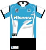
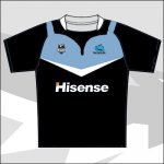
My take on all three proposed designs;
#1 looks like an Inter Milan jersey that's been put through the wash enough times that the blue has faded.
#2 is very passable because it has history. I don't like the white patch on the back, but it passes.
#3 honestly looks like it was designed for the Melbourne Storm and they just re-used the design with our colours. Although SF's version softens me to it, it's still a novelty design that wouldn't sell that much at all. If the objective is to sell these for a profit, options 1 & 3 are epic fails. Not to toot my own horn, but I think that version I did (which is obviously just our home jersey with switched colours) would sell twice as many as any of the other three. Happy to have Blades on board, unhappy with what they're showing us.
Haha, that'd look good on Cuthbo
(I apologise for Adam being turned into the scape goat of easy jokes. I hate that I do this to him. I need to fine tune myself as a writer)
#1 looks like an Inter Milan jersey that's been put through the wash enough times that the blue has faded.
#2 is very passable because it has history. I don't like the white patch on the back, but it passes.
#3 honestly looks like it was designed for the Melbourne Storm and they just re-used the design with our colours. Although SF's version softens me to it, it's still a novelty design that wouldn't sell that much at all. If the objective is to sell these for a profit, options 1 & 3 are epic fails. Not to toot my own horn, but I think that version I did (which is obviously just our home jersey with switched colours) would sell twice as many as any of the other three. Happy to have Blades on board, unhappy with what they're showing us.
I like the simple colour reversal idea that Coco put up.
We just have to be careful that it doesn't start looking like the attached though
Haha, that'd look good on Cuthbo
(I apologise for Adam being turned into the scape goat of easy jokes. I hate that I do this to him. I need to fine tune myself as a writer
)
Last edited:
Now that looks a lot better Sharks Forever!
Thats hot, id buy it in a second
Bizzy029
Bull Shark
Thats hot, id buy it in a second
+2