You are using an out of date browser. It may not display this or other websites correctly.
You should upgrade or use an alternative browser.
You should upgrade or use an alternative browser.
2011 Jersey Designs
- Thread starter mtk
- Start date
Capital_Shark
Kitty Master
- Joined
- May 7, 2006
- Messages
- 17,768
- Reaction score
- 2,437
err... anymore options?
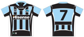
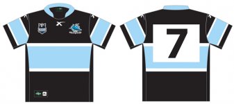
I'm leaning toward #2 only because it doesn't look like a soccer top, or a Panther's design. I'd rather stick with what we have than any of those 3.
We've got a member here whose jersey designs are all over these shockers.
I'm leaning toward #2 only because it doesn't look like a soccer top, or a Panther's design. I'd rather stick with what we have than any of those 3.
We've got a member here whose jersey designs are all over these shockers.
peachey
One of a kind
- Joined
- Sep 7, 2005
- Messages
- 15,219
- Reaction score
- 125
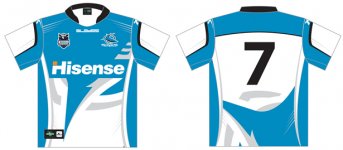
an away jersey that fits in the hisense logo, the current one looks like shyte with the hisense logo
snowman
Total gronk
exactly what i was thinking, one is inter milan and one is penrith
IronShark
Moderator
Seriously, they aren't too flash! I just realised that these are fair dinkum designs they will go with next year. For the love of God, don't let them pick number 1 or number three. They are dreadful.
Number 2 is acceptable, still not great. I'd love to see an "NFL" style of design tried, with numbers front and rear and the players name on the back.
Number 2 is acceptable, still not great. I'd love to see an "NFL" style of design tried, with numbers front and rear and the players name on the back.
I really don't mind #3 at all. I know its not sky blue, but if we have to have alternate jerseys (which I accept that we do), then I think #3 is fresh, exciting and nicely incorporates our logo.
But, having said that, I think I'll vote for #2 - the subtle rearrangement of colours on our traditional design is awesome.
But, having said that, I think I'll vote for #2 - the subtle rearrangement of colours on our traditional design is awesome.
I'd like to see long sleeved, turtleneck black scivvies and black felt berets worn at a rakish angle, brown corduroy casual jeans.
Afterall, that would look just as ridiculous as options 1 and 3... option 2 is passable but I reckon you always need black between the white and blue.
$0.02
Afterall, that would look just as ridiculous as options 1 and 3... option 2 is passable but I reckon you always need black between the white and blue.
$0.02
snowman
Total gronk
can someone whip up a model of number 3 with black where the blue is and sky blue where the white is? just to see what it looks like
IronShark
Moderator
So it looks like Blades is picking up on our jerseys. Does that mean a change to the home one?
Blades are doing all our merchandise next year mate. ISC is gone.
can someone whip up a model of number 3 with black where the blue is and sky blue where the white is? just to see what it looks like
I really don't like asymmetric jersey designs. They look totally lame.:No:
Blades are doing all our merchandise next year mate. ISC is gone.
Yeah, figured. I guess the home jersey design stays the same.
Maybe with Blades doing our jerseys, they might stay on in piece for a whole game!
El Coconuto
Great White
What the heck happened to out deal with ISC?
snowman
Total gronk
Blades are doing all our merchandise next year mate. ISC is gone.
I really don't like asymmetric jersey designs. They look totally lame.:No:
yeh possibly, but it wouldnt hurt to have a look
What the heck happened to out deal with ISC?
didnt renew i guess
Murphy
Great White
worst jersey design i have seen
I actually wouldn't mind a simple rearrangement of the colours on our current home jersey as our away jersey.
But then again, the marketing gurus of these big apparel comapnies tend to know what sells more units (although I don't know whose idea that grey disaster was a couple of years ago)
But then again, the marketing gurus of these big apparel comapnies tend to know what sells more units (although I don't know whose idea that grey disaster was a couple of years ago)
sharks4ever
Great White
i ldont mind 2 or 3 but please god dont let it be 1
snowman
Total gronk
worse than the grey one??