Official 2015 - 2024 Kit Thread

bort

Jaws
Joined
Jun 4, 2007
Messages
30,286
Reaction score
6,139
Location
IN A BAR
Bottom right looks the worst which is ironically the way we’ve been using it lately

As a standalone little image like it is there maybe, but I disagree it is the worst when actually on a jersey.

I like the lighter blue as a jersey colour and I also like that the logo stands out well against it still, without the white outline sharply contrasting.

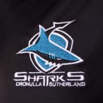
To me the logo on black becomes a bit cluttered by the sharply contrasting white outline. I also think for same blue background, while it is still okay, it gets lost a bit. Would be pretty hard to notice from any real distance on a players jersey.

Rabbitohs logo it all quite simple shapes so easier to play around with - we could cut the 'extra' stuff on ours like they do at times and just have the shark shape (no shield, no writing).
 

Addy

Jaws
Joined
Jun 21, 2010
Messages
8,831
Reaction score
991
Location
NSW/ACT
As a standalone little image like it is there maybe, but I disagree it is the worst when actually on a jersey.

I like the lighter blue as a jersey colour and I also like that the logo stands out well against it still, without the white outline sharply contrasting.

To me the logo on black becomes a bit cluttered by the sharply contrasting white outline. I also think for same blue background, while it is still okay, it gets lost a bit. Would be pretty hard to notice from any real distance on a players jersey.

Rabbitohs logo it all quite simple shapes so easier to play around with - we could cut the 'extra' stuff on ours like they do at times and just have the shark shape (no shield, no writing).


The shark and shield looks good without the wordmark.

The shark by itself looks terrible, too skinny and angular.

But in saying that, there is a sticker in the Sharks Store where it's looks like they've softened some of the edges and given the shark a sandwich. Looks a lot better.

IMG_0718.JPG
 

bort

Jaws
Joined
Jun 4, 2007
Messages
30,286
Reaction score
6,139
Location
IN A BAR
The shark and shield looks good without the wordmark.

The shark by itself looks terrible, too skinny and angular.

But in saying that, there is a sticker in the Sharks Store where it's looks like they've softened some of the edges and given the shark a sandwich. Looks a lot better.

View attachment 25719

Damn you’re right, that’s dreadful haha
Looks so long and thin with fins too in the middle
I hope we never use that
 

Addy

Jaws
Joined
Jun 21, 2010
Messages
8,831
Reaction score
991
Location
NSW/ACT
Head mark logo (normal logo without the wordmark)

IMG_0719.PNG

Shark logo (the above minus the shield)

IMG_0720.JPG

NRL logo, they've been pushing a uniformed logo over the past 2 seasons

IMG_0721.JPG
 

Art Vandelay

Tiger Shark
Joined
Jan 14, 2010
Messages
1,045
Reaction score
49
Location
Canberra

Addy

Jaws
Joined
Jun 21, 2010
Messages
8,831
Reaction score
991
Location
NSW/ACT
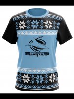
I was gonna grab my uncle one as a ****ty joke gift but **** $60 on a t-shirt ugly or not.

Try and find an ugly sweater from a few years back, they'd be around the same price or cheaper, but it's an actual jumper. Full Clark Griswald
 

Capital_Shark

Kitty Master
Joined
May 7, 2006
Messages
17,768
Reaction score
2,436
Try and find an ugly sweater from a few years back, they'd be around the same price or cheaper, but it's an actual jumper. Full Clark Griswald

Yeah seen those but jumpers and xmas don't really go together.

Since no one in their right mind would pay $60 for that there will be plenty left over to grab on sale for next xmas.
 
Top