Official 2015 - 2024 Kit Thread

Joined
Apr 27, 2010
Messages
8,939
Reaction score
848
Location
Sydney
I want them to bring out some decent jackets and hoodies. Last few years ones have been pretty rubbish.
 

Wiz

Jaws
Joined
Mar 23, 2016
Messages
5,906
Reaction score
1,514
Do u think the logo would be very visible if it were? Id love to see us go a full black silhouette shark

Yeah I reckon it would.. if I was good at photoshop I would do it myself to see what it’d look like.
 

gando2230

Jaws
Joined
Jun 1, 2006
Messages
10,882
Reaction score
63
Location
Cronulla
Not sure about the design for the playing shorts. It would be be ace design for the training shorts.
 
Joined
May 17, 2010
Messages
28,420
Reaction score
784
Location
NSW
The logo is dark blue as it was introduced during that brief period in 2004-2006 where we lost our marbles and wore a dark blue jersey with gills on the sides. Awful stuff.

Dude this clubs never known wheres its marbles are
 

Addy

Jaws
Joined
Jun 21, 2010
Messages
8,831
Reaction score
991
Location
NSW/ACT
I remember, maybe just before Super League, they gave out pins with a black shark logo, and I thought it was going to bet get new logo, but we ended up with the happy shark in the star.

But it might have just been a generic shark pin.

I'll see if I can find it.
 

Tatus

Not-So-Great White
Joined
Jan 18, 2011
Messages
10,113
Reaction score
789
Location
South Coast
Tatus is the man for this.
I’m flattered, but my ability is limited to tracing around a picture and putting it on another. Did you see that Johns is the new halves coach for the Eels though? Interesting clip board he’s holding there
7ABA3FDA-DEA8-4559-B8AA-4D6DA193F2C1.jpeg
 

Wiz

Jaws
Joined
Mar 23, 2016
Messages
5,906
Reaction score
1,514
I’m flattered, but my ability is limited to tracing around a picture and putting it on another. Did you see that Johns is the new halves coach for the Eels though? Interesting clip board he’s holding there
View attachment 25715

You’re the perfect man for the job
 

Tatus

Not-So-Great White
Joined
Jan 18, 2011
Messages
10,113
Reaction score
789
Location
South Coast
You’re the perfect man for the job

If you can give me the logo you want on what shirt I could whip something up, but I couldn’t edit a logo or make a new one

Edit* google helped me out
433DBA68-A9A9-42F3-BBFB-CD1EE01C0897.jpeg
 

Wiz

Jaws
Joined
Mar 23, 2016
Messages
5,906
Reaction score
1,514
If you can give me the logo you want on what shirt I could whip something up, but I couldn’t edit a logo or make a new one

Edit* google helped me out
View attachment 25717

No lol was wondering how it would look if the jersey was in the blue our actual logo is.. it’s the same blue we’ve used on the new training shirts
 

bort

Jaws
Joined
Jun 4, 2007
Messages
30,287
Reaction score
6,139
Location
IN A BAR
No lol was wondering how it would look if the jersey was in the blue our actual logo is.. it’s the same blue we’ve used on the new training shirts

If the top main colour was the blue from logo we probably would need to use the back and white logo so you could actually see it.

Seeing Tatus' effort kinda makes me wish our logo was a little bigger on the new jersey too. It doesn't really stand out very much and is much smaller than NRL logo
 

Addy

Jaws
Joined
Jun 21, 2010
Messages
8,831
Reaction score
991
Location
NSW/ACT
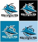
Sharks logo can exist on the same colour blue as the shark (bottom left), which it did in the mid 2000's.

It's designed to work on both black or white backgrounds, but using a white outline or changing the colour of the wordmark (both top pics)

The last few years we've been using the logo without the outline, and just having the colours differentiate the seperate parts of the logo (bottom right)

IMG_0717.JPG
 

Wiz

Jaws
Joined
Mar 23, 2016
Messages
5,906
Reaction score
1,514
Sharks logo can exist on the same colour blue as the shark (bottom left), which it did in the mid 2000's.

It's designed to work on both black or white backgrounds, but using a white outline or changing the colour of the wordmark (both top pics)

The last few years we've been using the logo without the outline, and just having the colours differentiate the seperate parts of the logo (bottom right)

View attachment 25718

Bottom right looks the worst which is ironically the way we’ve been using it lately
 
Top