You are using an out of date browser. It may not display this or other websites correctly.
You should upgrade or use an alternative browser.
You should upgrade or use an alternative browser.
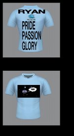
Your jersey design
- Thread starter Addy
- Start date
blacky
Hammerhead
No idea nulla at a guess maybe the white training Jersey or a blacky version of it
blacky
Hammerhead
Busted Bongos
Hammerhead
I would buy one of these in a heart beat
blacky
Hammerhead
Yeah it does .well that sux we have to scrap that one . Didn't notice till you said nulla
blacky
Hammerhead
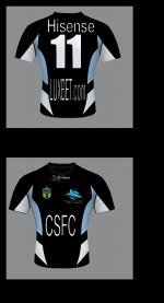
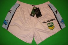
Nulla I believe our alternate Jersey is our white training Jersey as I have just found on Ebay white shorts that match the Jersey and they are billed as 2013 alternate infield playing shorts.
blacky
Hammerhead

slide rule
Jaws
I like something along those lines as some kind of alternative.
They need to fix the current hoops jersey. It looks cheap and nasty. The Hoops jersey is by far and away my favourite Sharks jersey ever, HOWEVER the current incarnation of it is poorly executed.
To make it look better I think they need to do the following:
-Change the neck- The round neck does not go well with this design. Some kind of modern "V" neck would look best
-Lower the Hoop- it is just a touch high, or something
- Narrow the hoop- especially if we don't have a sponsor, or if the sponsor ends up being just words like "Fisherman's Friend".
- I think there is something wrong with the cut of the jersey. It should taper in around the belly more or something. It just doesn't seem to look flattering.
- I think the badge needs to be looked at as well. I'm not sure what it is exaxctly, but it just doesnt suit this jersey.
I just think Blades have done a particularly bad job on this jersey.

slide rule
Jaws
^That's pretty much perfect. Looking at that, I think the main issue with the current jersey is the windth of the white stripe and the neck. They could probably use a slightly darker shade of blue as well.
blacky
Hammerhead
blacky
Hammerhead
blacky
Hammerhead

slide rule
Jaws
Do we even have an away jersey yet? Is it still the black hoops? I thought we might be due for a new one this year?
JimBob
Jaws
Do we even have an away jersey yet? Is it still the black hoops? I thought we might be due for a new one this year?
Pretty sure it's still the black hoops.
DANGA HATCH
Grey Nurse
- Joined
- May 20, 2009
- Messages
- 558
- Reaction score
- 11
Best jersey in the league! Love the powers one best of all!