Official 2015 - 2025 Kit Thread

toomuchsoup

Bronze Whaler
Joined
Aug 8, 2023
Messages
113
Reaction score
117
These are great man nice work.

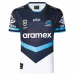
I think my major issue with this kit, along with the aramex box obviously, is that narrow blue separating the black and white.

#2 without it would be elite imo
Yeah that blue line bugs me too
 

Attachments

  • Untitled design - 2.png
    Untitled design - 2.png
    1.5 MB · Views: 97

SF

Mako Shark
Joined
Dec 16, 2005
Messages
12,818
Reaction score
5,601
Location
Monty Porter Stand
Yeah that blue line bugs me too


index.php
That really looks good. Not just acceptable... it's one I'd want to buy.

Hopefully there is still time to change it.
 

Jaz

Great White
Joined
Nov 18, 2009
Messages
4,393
Reaction score
1,194
Location
Jannali
One million times better but for the $$ they put in Aramex deserves to have its brand in its colours. If that's a red logo on a white background we simply have to design a jersey that has white in that mid section. It's not rocket science - can't believe the club approved that POS.
 

G.H Shark

Bull Shark
Joined
May 30, 2024
Messages
1,717
Reaction score
1,435
No matter the jersey they pick, it's our socks that are absolute garbage. The pattern is yuck and the blue doesn't even match our jersey.

They look like those socks old taxi drivers used to wear.

We've got a different blue for the jersey, for the socks, for the logo. Who the hell approved this?

Literally someone said, yup that matches...did they approve off a drawing or off samples?
 

Attachments

  • Screenshot_20241123-073659.png
    Screenshot_20241123-073659.png
    421.2 KB · Views: 15

SF

Mako Shark
Joined
Dec 16, 2005
Messages
12,818
Reaction score
5,601
Location
Monty Porter Stand
No matter the jersey they pick, it's our socks that are absolute garbage. The pattern is yuck and the blue doesn't even match our jersey.

They look like those socks old taxi drivers used to wear.

We've got a different blue for the jersey, for the socks, for the logo. Who the hell approved this?

Literally someone said, yup that matches...did they approve off a drawing or off samples?
I honestly can't say I've ever noticed the socks. We have the highest "high sock" rate in the NRL, so the players mustn't mind :)
1732308281090.png
 

G.H Shark

Bull Shark
Joined
May 30, 2024
Messages
1,717
Reaction score
1,435
I honestly can't say I've ever noticed the socks. We have the highest "high sock" rate in the NRL, so the players mustn't mind :)
View attachment 32019
Lol that's great.

But still why do we have three different shades of blue on our jersey?

The sock design is not even a Sharks design that matches the hoops.
 

Wizard

Great White
Joined
Mar 21, 2024
Messages
3,344
Reaction score
3,630
Before and After:

BeforeUpdated Version by @toomuchsoup
index.php
index.php
This is the power of merch and why we get disappointed when the club continuously drops the ball

Lost sales for the club and lost chance for fans to wear something new/decent looking

*the Shark blue instead of the sky blue is a winner
 

bort

Jaws
Joined
Jun 4, 2007
Messages
36,714
Reaction score
12,484
Location
IN A BAR
One million times better but for the $$ they put in Aramex deserves to have its brand in its colours. If that's a red logo on a white background we simply have to design a jersey that has white in that mid section. It's not rocket science - can't believe the club approved that POS.
Some kind of hoop seems like a good solution…
 

Sparkles

Jaws
Joined
May 21, 2008
Messages
14,030
Reaction score
4,851
Yeah I really like #2, #3, and #4. You're hired!

Maybe too much sky blue for 3 and 4 to qualify for an away strip though?

But #2 would be great if you could Aramex to agree to the brand color change.

index.php
That's the kicker. The Aramex brand people are just being awkward. They're thinking the last thing they want is for the logo to blend in, I imagine.
 

bort

Jaws
Joined
Jun 4, 2007
Messages
36,714
Reaction score
12,484
Location
IN A BAR
That's the kicker. The Aramex brand people are just being awkward. They're thinking the last thing they want is for the logo to blend in, I imagine.
Absolutely
They are actively motivated to not blend it
 

G.H Shark

Bull Shark
Joined
May 30, 2024
Messages
1,717
Reaction score
1,435
That's the kicker. The Aramex brand people are just being awkward. They're thinking the last thing they want is for the logo to blend in, I imagine.
By every right they deserve to have their logo to stand out.

It's up to the club to have some sort of creativity and sense to make it work.

I want to buy a new jersey but I've got enough bloody hoop versions.
 

stalefish

Hammerhead
Joined
Dec 21, 2021
Messages
453
Reaction score
449
so its our away game in vegas yea? if we're playing in that does that mean the panthers have to wear their white or pink jersey? or are we just gunna roll with our home jersey cause they in black..?

so many questions..
 

MrDravid

Great White
Joined
Apr 11, 2022
Messages
4,142
Reaction score
3,178
That's the kicker. The Aramex brand people are just being awkward. They're thinking the last thing they want is for the logo to blend in, I imagine.
The actual Aramex logo looks like it white on red, which would look a fair bit worse then the current logo.

I can imagine they've said we want the current logo on the match jerseys, which considering what they are paying, I don't have a problem with.
 
Top