You are using an out of date browser. It may not display this or other websites correctly.
You should upgrade or use an alternative browser.
You should upgrade or use an alternative browser.
ARLC - Independent Commission
- Thread starter gosharks
- Start date
Not too sure that changing the logo would have been up there in my list of priorities... but anyhooo...
ARLC to unveil new look and plan: http://www.smh.com.au/rugby-league/league-news/arlc-to-unveil-new-look-and-plan-20121029-28duv.html
ARLC to unveil new look and plan: http://www.smh.com.au/rugby-league/league-news/arlc-to-unveil-new-look-and-plan-20121029-28duv.html
slide rule
Jaws
How pretty!!!
A.Snowden
Jaws
looks like they slapped that up in 5 minutes. Similar to our cricket logo as well.
Gibs
Great White
I like our current NRL logo this one looks like crap
Bundy Shark
Jaws
looks like they slapped that up in 5 minutes. Similar to our cricket logo as well.
You're not wrong AS.
djhabib
Jaws
I wonder how much that all cost to do
http://www.nrl.com/rugby-league-launches-new-brand-logo/tabid/10874/newsid/70308/default.aspx?
Mhttp://www.nrl.com/rugby-league-launches-new-brand-logo/tabid/10874/newsid/70308/default.aspx?ore info about the re-branding in that video.
Some reasonable key points in rationale / manifesto in the video - albeit ridiculously histrionic - but I'm still unconvinced.
Mhttp://www.nrl.com/rugby-league-launches-new-brand-logo/tabid/10874/newsid/70308/default.aspx?ore info about the re-branding in that video.
Some reasonable key points in rationale / manifesto in the video - albeit ridiculously histrionic - but I'm still unconvinced.
A lot of people on here, on Twitter and in the media are likening it to the Cricket Australia badge. It is in colour, but I think its directly inspired by the NFL badge, which is no bad thing. Strong national colours* and references to RL culture with the badge shape and 'v'. Genuine meaning attached to it, and something that needn't change often.

*Which is also the problem with the design- what of New Zealand? I can only imagine that the ARL see themselves as just that- the Australian Rugby League Commission, who run the game and its elite competition in Australia, rather than Australia/NZ. That's the only dubious issue for me. The Warriors will have to wear a replica Kangaroos logo on their jerseys? That will go down well...


*Which is also the problem with the design- what of New Zealand? I can only imagine that the ARL see themselves as just that- the Australian Rugby League Commission, who run the game and its elite competition in Australia, rather than Australia/NZ. That's the only dubious issue for me. The Warriors will have to wear a replica Kangaroos logo on their jerseys? That will go down well...
Bundy Shark
Jaws
Well they do want to play in an Australian competition AB so they really need to cop it.
slide rule
Jaws
Great video with the Coogee Dolphins getting more recognition than the Cronulla Sharks.
Well they do want to play in an Australian competition AB so they really need to cop it.
Yep, that's one perspective.
Its also the biggest/best growth market in terms of exposure and playing talent available IMO. I'm sure it was considered... but I'd like to hear/read the reasoning for the decision to essentially thumb the game's collective nose at the World Cup winning country. I don't geddit.
slide rule
Jaws
I don't think they really have any jurisdiction over in NZ though (apart from the warriors participating in the top level). It's really the job of the NZRL to do the development work etc over there I suppose.
Mr Ryan
Bull Shark
- Joined
- Nov 6, 2010
- Messages
- 2,159
- Reaction score
- 290
A lot of people on here, on Twitter and in the media are likening it to the Cricket Australia badge. It is in colour, but I think its directly inspired by the NFL badge, which is no bad thing. Strong national colours* and references to RL culture with the badge shape and 'v'. Genuine meaning attached to it, and something that needn't change often.
View attachment 19386
View attachment 19385
*Which is also the problem with the design- what of New Zealand? I can only imagine that the ARL see themselves as just that- the Australian Rugby League Commission, who run the game and its elite competition in Australia, rather than Australia/NZ. That's the only dubious issue for me. The Warriors will have to wear a replica Kangaroos logo on their jerseys? That will go down well...
Rugby League Week are saying on Facebook that the Warriors will wear this logo
slide rule
Jaws
That logo belongs in Best and Less.
cuz
cuz
evertonshark
Jaws
What a **** logo
WillyInBris
Jaws
What crap.
Looks like a dad's army patch.
Nothing wrong with the current one
I was thinking the same thing Gil.
Sixgill
Moderator
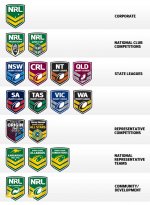 If I was asked to list the top ten things that needed to be immediately dealt with and have money spent on in the NRL, 'rebadging' or rebranding would not have appeared.
I can't comment on the video because internation al viewing is not allowed :/
But...The font is hideous.
The southern cross is offset on the main but centred on the Kangaroos?
And on the Kangaroos one, it's so busy. Is there really a need for the word Kangaroos and its inception?
Just the kangaroo, cross and chevron would be heaps better. It's almost like they're creating history with 'since...' Reminds me of companies like Billabong stating their birth year to suggest longevity, history and reliability.
CRL isn't a part of NSWRL? Seemed like the ideal time to fix that.
I guess it's easy to nitpick but if you're going to put money into something this unnecessary then they'd better be prepared for some questions.
State of Origin one is tacky. Get rid of the Nutri Grain inspired faces and just have the light blue and maroon halves of the chevron meet in the middle.
I'll stop now at risk of being branded a negative.
The various state designs and colours look strong and unified. The font on those is much classier than the corporate NRL 'snazzy futuristic interconnected' one.
How long did they spend on this?
slide rule
Jaws
CRL isn't a part of NSWRL? Seemed like the ideal time to fix that.
Yeah, I thought that was one of the levels of the game that was meant to be removed. I thought they wanted to flatten the structure and remove as many of the "blazer wearers" as possible.
