You are using an out of date browser. It may not display this or other websites correctly.
You should upgrade or use an alternative browser.
You should upgrade or use an alternative browser.
Official 2015 - 2024 Kit Thread
- Thread starter Addy
- Start date
CrazyMatt
Jaws
The hoop is back? Should never of changed in the first place after 2016.
Tatus
Not-So-Great White
A new collar! Thank the heavens!
Is the hoop a bit thinner or higher than it used to be? Looks a little funny but I'm sure I'll get used to it. IMO we should never go away from it.
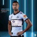
It's back to our traditional hoop.
Compared to our 2016 hoops, which is now a classic and most prominent in people's mind, we have lost the second smaller hoop, the black side panels and shoulder panels.
So his new design is a lot less cluttered and seems a bit weird, and the NRL logo has lost its box, making it even more sparse.
The biggest loss though is the hoops on the sleeves, they needed that to complete the design
You're right - not sure how I didn't see it. Agree the arm hoops are a loss.
HaroldBishop
Megalodon
Funny, that's exactly how my rig looks in a jersey.
Wiz
Jaws
- Joined
- Mar 23, 2016
- Messages
- 5,906
- Reaction score
- 1,514
Better then previous years. Still think we have the best colours/mascot to potentially have one of the best looking jerseys. Its just not there yet
Can anyone tell me why we use a different blue then the blue we use on our actual logo ... seems weird. is there any other team that does that ?
wonder what that jersey would look like if it’s in the same blue as our shark(training shirt)
Funny, that's exactly how my rig looks in a jersey.
Ever tried a players cut? Half the time you'd be lucky to get your arm in it
egg
Jaws
- Joined
- Apr 11, 2010
- Messages
- 12,835
- Reaction score
- 1,025
BlackWhiteBlue
Jaws
Better then previous years. Still think we have the best colours/mascot to potentially have one of the best looking jerseys. Its just not there yet
Can anyone tell me why we use a different blue then the blue we use on our actual logo ... seems weird. is there any other team that does that ?
wonder what that jersey would look like if it’s in the same blue as our shark(training shirt)
Do u think the logo would be very visible if it were? Id love to see us go a full black silhouette shark
Do u think the logo would be very visible if it were? Id love to see us go a full black silhouette shark
The thing is, once you go black, you never go back
Bundy Shark
Jaws
The thing is, once you go black, you never go back
So I’ll ‘Addy’ you to the list that has experience on this mate, gotta say, I’ll have to take your word for it!
So I’ll ‘Addy’ you to the list that has experience on this mate, gotta say, I’ll have to take your word for it!
There's a list wtf
HaroldBishop
Megalodon
Ever tried a players cut? Half the time you'd be lucky to get your arm in it
I have and the ladies love it
Patrick
Bronze Whaler
- Joined
- Sep 9, 2011
- Messages
- 177
- Reaction score
- 88
Better then previous years. Still think we have the best colours/mascot to potentially have one of the best looking jerseys. Its just not there yet
Can anyone tell me why we use a different blue then the blue we use on our actual logo ... seems weird. is there any other team that does that ?
wonder what that jersey would look like if it’s in the same blue as our shark(training shirt)
The logo is dark blue as it was introduced during that brief period in 2004-2006 where we lost our marbles and wore a dark blue jersey with gills on the sides. Awful stuff.

